
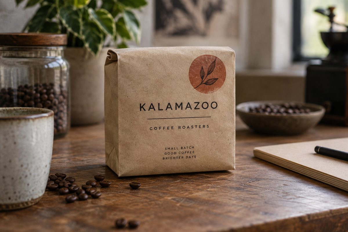
Contrast under review.
Compact brand identity design needs clear rules for light and dark surfaces. Printed contrast tests show where a fine detail loses definition, before that detail reaches the production files.
Work and scope

KZOO Studio makes logo and compact brand identity systems for local businesses that need a clear mark, sensible rules, and files ready for the next use.
The logo and mark service includes one primary mark direction, refinement, and production-ready exports. The compact identity system adds type, colour, spacing, and basic application rules.
A logo is not a personality test. Our logo design work in Kalamazoo starts with where the mark will appear. A browser tab needs a different test from a storefront sign: small details can disappear long before the overall shape becomes hard to see.
The engagement is inquiry-only. The price basis is agreed mark scope and revision count for a mark, or the number of agreed identity components for a system. No binding price is displayed before the brief is understood.
Compare all service scopes

The first pass is deliberately plain. We test the mark in black and white before colour chips, mockups, or application theatre enter the room.
That exposes weak spacing, awkward joins, and detail that disappears below reproduction size. Then we choose type and colour with a reason. A warm grey may carry a secondary surface. Vermilion may mark an action or a correction. It does not become wallpaper.
For a brand refresh in Kalamazoo, the hard part is often removal. Familiarity is worth keeping when it helps people recognize the business. It is not a reason to preserve a detail that disappears in print.
The handoff folder contains the files your printer and browser can actually use. Type rules and application guidance belong to the identity-system scope; they are not automatically included in a mark-only engagement.
One agreed direction refined for the intended identity scope, with clear light and dark use where needed.
SVG for digital use, PDF for print production, and raster exports for ordinary day-to-day placement.
Named type choices, hierarchy, colour values, and the limits that stop the system becoming muddy.
Enough guidance for a card, sign, document, and page. Not a padded manual written to look expensive.
The agreed ask, choice, and handoff boundary, so a future use does not reopen the whole argument.
A presentation can forgive a mark. A printed edge cannot.
Compact brand identity design needs clear rules for light and dark surfaces. Printed contrast tests show where a fine detail loses definition, before that detail reaches the production files.
A strong mark does not need a colour field to sound confident. We check crop marks, edge pressure, and one-colour reproduction before the polish.
If the offer is unclear, a new mark will not repair the business. We will say that early.
This service suits a new business, a focused launch, or a brand refresh with a specific use in mind. It is not a full campaign, a naming exercise, or an open-ended strategy programme. It does not include unlimited revisions.
The studio keeps a written decision record. You can check what is being made and why before the files are released.
Bring us a briefTell us what exists, where the identity will appear, and whether you need only a logo or the compact system around it.
The quote depends on agreed mark scope and revision count, or the number of identity components. We confirm that basis before work starts.
Bring us a brief